Recently, while working on changes for a client’s website, she challenged our team on why we were suggesting changes to her logo and overall brand color scheme. Coming from a financial background, she wanted numbers to explain the recommendations and not just a “well it looks better” response. This interaction inspired me to research the art and science behind what colors and fonts look best for logos and why we like certain ones more than others.
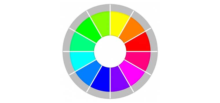
Although it’s hard to explain why people gravitate toward certain colors and designs, science does show us that we have preconceived notions about color. Think of red means stop and green go. But yellow can be viewed as caution, sunshine, and happy. Blue makes many people think of medical things and, for some, purple can be spiritual.
Fonts also evoke certain reactions. You wouldn’t want a logo or tagline in all caps using the Chiller font unless you needed to yell information about The Walking Dead. For logo development, simple and easy-to-read fonts are best so customers can quickly recognize the name of your company.
To reinforce these ideas, let’s look at some of America’s favorite brands and their logos. Apple is iconic in its simplicity. It’s easy to identify what it is, reproduces well digitally, in print, and on products. What about Google? Google’s logo is colorful and simple and appears to be helpful … doesn’t it? Another example is Amazon and its smile logo. That captures the thought that most people are happy to receive an Amazon box. These companies show how a successful blend of the right colors, fonts, and design reinforces their brand’s image.
Of course, most companies don’t have the time or resources to devote to logo development like Apple or Google but there are some key pointers that can be universally applied. Here are a few ideas that might be helpful when considering a new logo, updating an existing one, and refreshing your organization’s overall “look:”
- Keep it simple – clean lines appeal to most people and it’s easier to reproduce on digital formats such as your company’s website as well as in print on business cards, signage, etc.
- Select and use colors sparingly – again simple is the best way to go. Two complementary colors is probably the most your company logo needs.
- Use a professional to design it. Yes, it costs some money but in the long run the logo will look professional and better represent your company to the world. Clip art won’t cut it.
If you still need science to support these ideas or if you want to know which color most people prefer (it’s blue), check out these resources about the psychology of color: Journal of Consumer Psychology, Psychology and Marketing, and the Journal of Consumer Research.

